Enterprise portal
Enterprise Portal allows healthcare providers to monitor RTM-enrolled patients’ medication adherence and regimen changes.
In 2022, Hero needed a strategic shift from a D2C model to a B2B2C model to qualify for reimbursement from the Remote Therapeutic Monitoring (RTM) program. The project's goal was to create an enterprise portal for healthcare provider agents to manage leads and patients using the Hero platform.
My role
Collaborated closely with the Enterprise Lead and Product Manager to understand the project's objectives and requirements.
Led the UI/UX design process for the MVP Enterprise Portal project.
Conducted thorough user acceptance testing (UAT) to ensure accurate implementation of functions, visuals, layout, and copy.
Project scope & challenge
The portal required four main parts: Identity and Access Management (IAM), Lead Management, and Member Management. The challenge was to design and ship these components within a tight 3-month timeline which required thoughtful design and integration to ensure a seamless user experience.
Understanding agent workflow
During the time of designing the Enterprise Portal, Hero's healthcare provider partner agents operated in the following manner:
Patient/Caregiver Information Handover: Agents received patient/caregiver information from Hero
Qualification Check Call: Agents conducted qualification check calls with patients/caregivers, taking notes during the process to verify eligibility for the program.
Third-Party App Integration: Agents utilized a third-party app integrated with Hero's API to monitor patient adherence. However, the app's color-coding for various schedule scenarios posed challenges for agents in quickly comprehending the information.
Recreated the third-party schedule. It using more than 10 different colors to represent each scenario.
MVP goals
The primary objective of the MVP is to design the Enterprise Portal, focusing on streamlining the Lead Management process and providing easy Member Management for healthcare provider agents. Despite the discovery of various user needs, the tight deadline necessitates prioritizing these key functionalities for successful delivery.
IAM (Identity and Access Management)
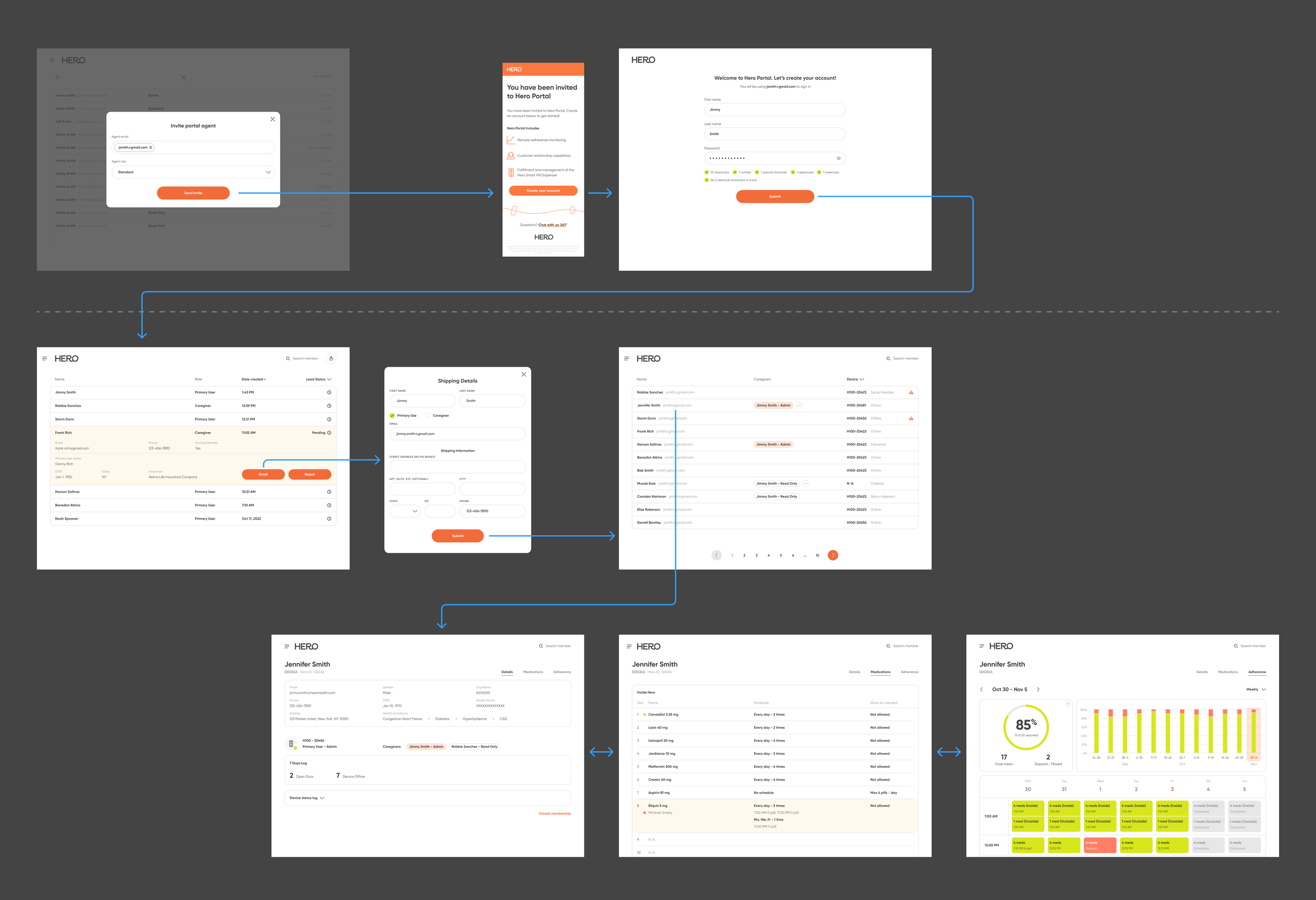
The IAM component is straightforward, with sign-up, sign-in, and MFA (Multi-Factor Authentication) designs following conventional approaches, ensuring a smooth user experience without confusion during the process.
Agent invitation and management was also designed for IAM.
Lead Management
For the MVP version, we simplified the qualification process to a one-step qualification, as we were uncertain if all providers would follow the initial two-step process.
Nevertheless, the lead management section still empowers provider agents to efficiently view and contact individuals interested in joining the program, whether they sign up for themselves or are signed up by their loved ones.
Member Management
List view
The list view in Member Management displays all primary users alongside their corresponding devices and statuses. If the primary user's device was set up by their caregiver, the caregiver's name is highlighted for visibility, indicating them as the primary contact.
Provider agents can use the filter to identify members requiring assistance and utilize the search function to locate specific members efficiently.
Dropdown filter
Search
Member profile: Details
The detail page presents the member's basic information, caregivers, device status, and the device status log.
Member is a caregiver
Member is a user and a caregiver
Member profile: Medication view
The medication list offers a comprehensive view of members' medication status and schedules for each medication. Empty and expired medications are highlighted to indicate that the member may need assistance with these medications.
Member profile: Adherence
The adherence page provides members' weekly and monthly adherence overviews and details in a calendar view.
Adopting the same color scheme (green for taken, red for not taken, yellow for as-needed) as the app view, the adherence view for agents ensures glanceable and user-friendly insights, helping agents to synchronize effectively during their routine check-ins with members.
Weekly calendar
A schedule dose drill down
Monthly view with a day drill down
Result
Successfully completed the project within the challenging 3-month timeline, which involved delivering high-fidelity prototypes in just 3 weeks. The efficient execution enabled the sales team to seize new business opportunities effectively and drive growth for the Enterprise Portal.


