Orion
Design a treatment monitoring tool for focal laser ablation tested with men with prostate cancer.
Prostate cancer affects 1 in 9 men, and it is one of the most common cancers in the United States. However, traditional prostate cancer treatments are removing or irradiating the whole prostate costing patients’ quality of life.
Avenda Health, founded in 2017, hopes to revolutionize prostate cancer treatment by using AI and Big Data to improve treatment outcomes.
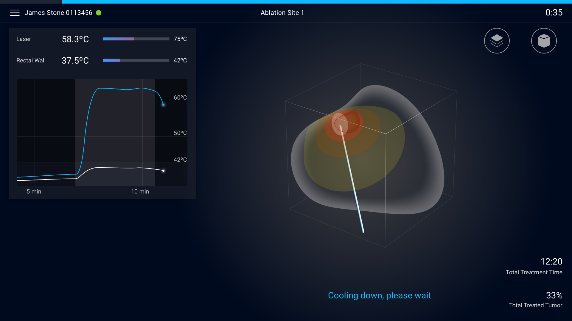
I joined Avenda Health in June 2018 and designed the treatment monitoring tool in Orion, the focal laser ablation system. The goal for the monitoring tool is to provide physicians with an intuitive and streamlined experience through real-time data recording and analysis while the laser ablation takes place.
Goal
- Create an intuitive and safe monitoring system prototype for the clinical trial.
- Create an aesthetically pleasing user interface to surprise and delight the company stakeholders and investors.
Patient list
MRI View
Pre-laser
Standby procedure
Menu
Laser active
Laser active page with heat map on
Damage map on with pop-up notification
Cool down
Treatment summary
Process
Some material and process such as User Journey Map, Information Architecture, and Flow Chart are not shown below due to the non-disclosure agreement.
Field research
In the early stage of the project, I interviewed three doctors both on-site and through phone calls to have a better understanding of the current surgery process, pain points, and their vision. Also, had opportunities shadowing three targeted biopsy and three different prostate surgeries in UCLA.
Landscape analysis
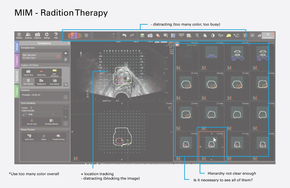
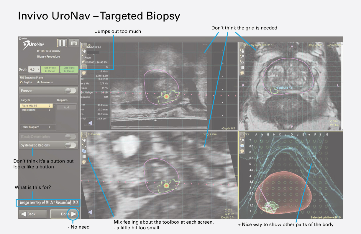
Due to the limited amount of available focal therapy machines, I created a landscape analysis that also included targeted biopsy, radiation therapy, and cardiac ablation.
Persona
Design criteria
SAFETY FIRST
Any medical device that is involving laser and heat can be hazardous for the patient and doctors. To ensure everyone’s safety and passing FDA review, safety is our top priority when we design the Orion system.
EFFORTLESS OPERATION
The operating room has a lot of things going on during the surgery. Doctors usually operate surgery under high pressure. Information that is well organized and easy to find can take out a lot of stress from the doctor.
INTUITIVE CONTROL
Most of medical OS are extremely busy, complicated, and hard to use. It doesn’t have to that way. Our goal for the Orion system is to design the system that is so easy to use, non-medical personnel can operate the system.
Brand DNA & mood board
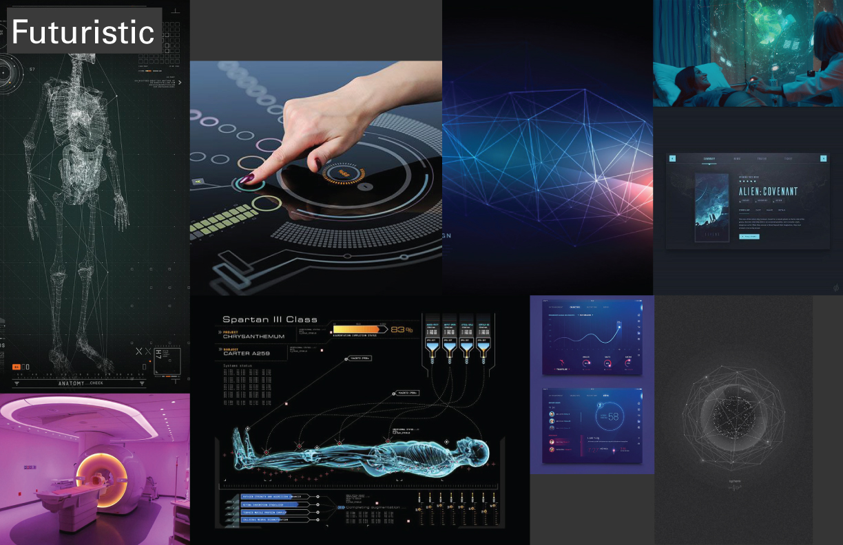
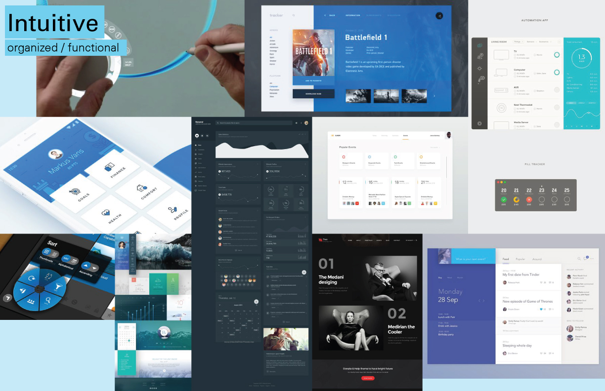
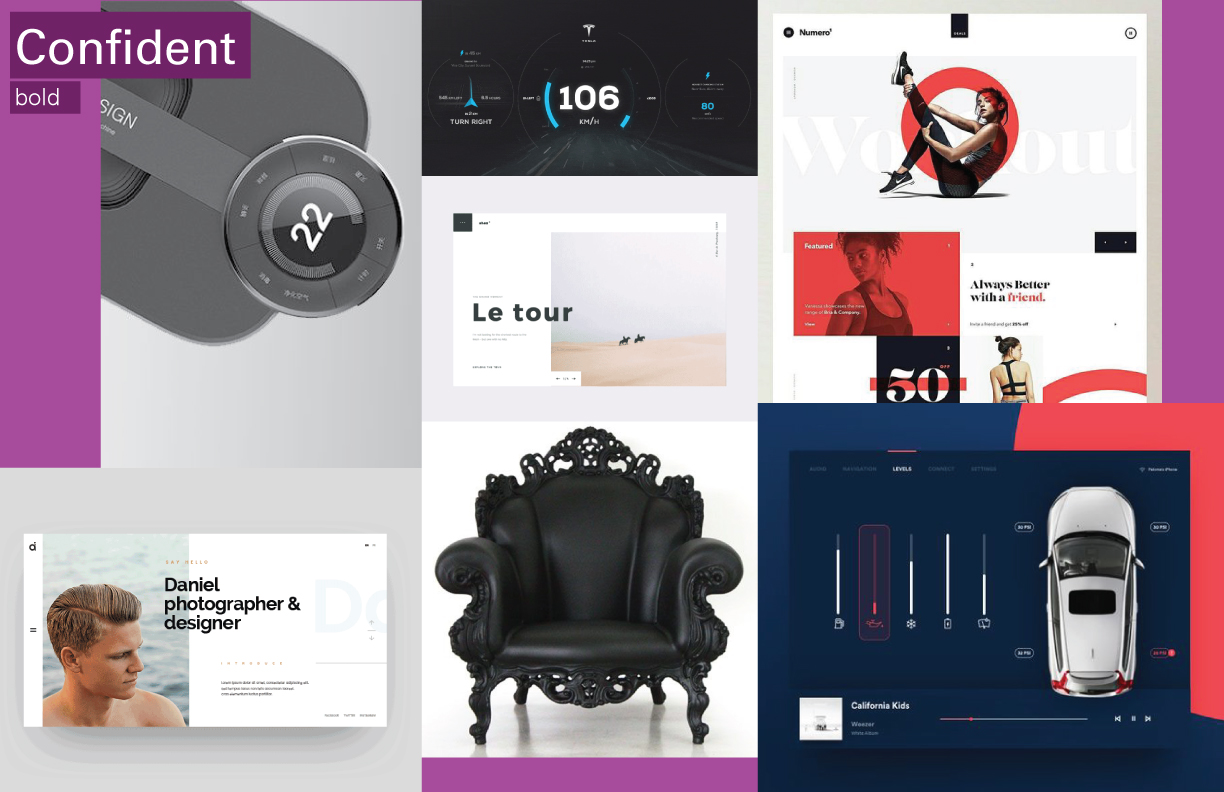
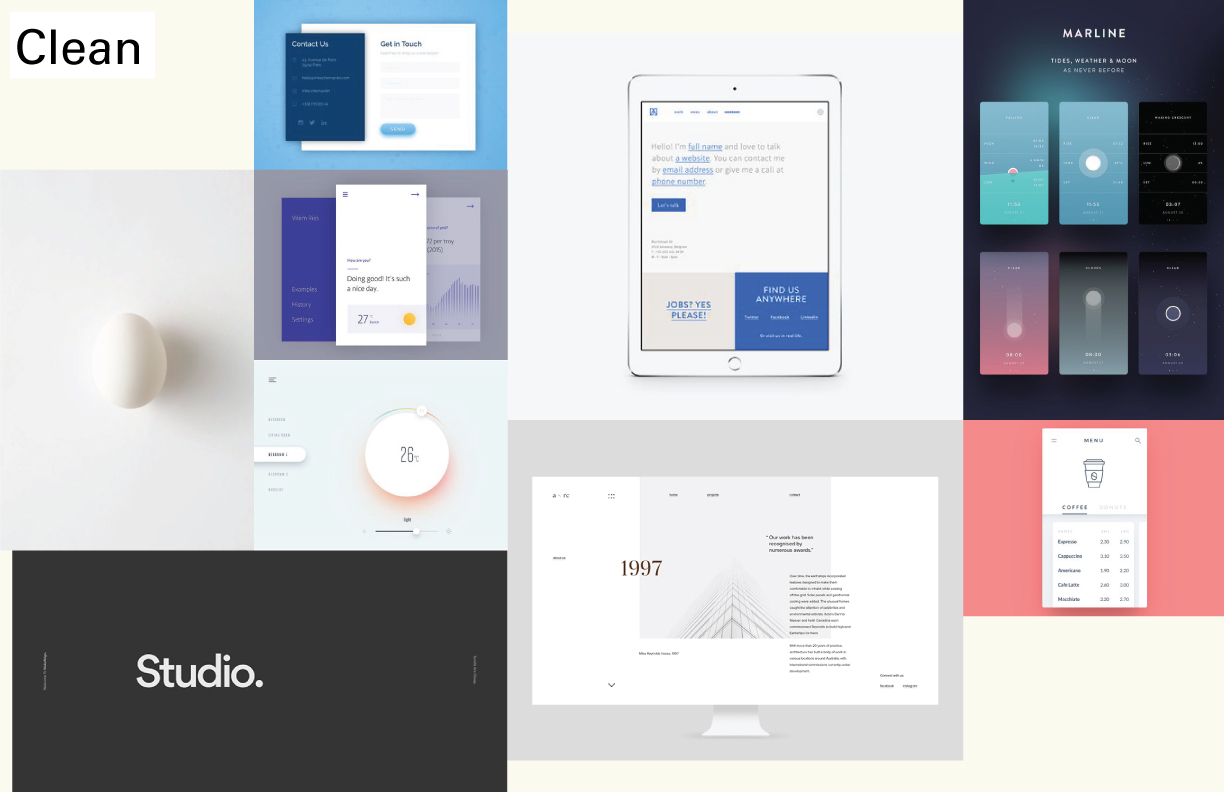
Hosted a meeting with the team and let everyone share their thoughts and vision of Avenda Health. The activity led us to five keywords to represent Avenda Health.
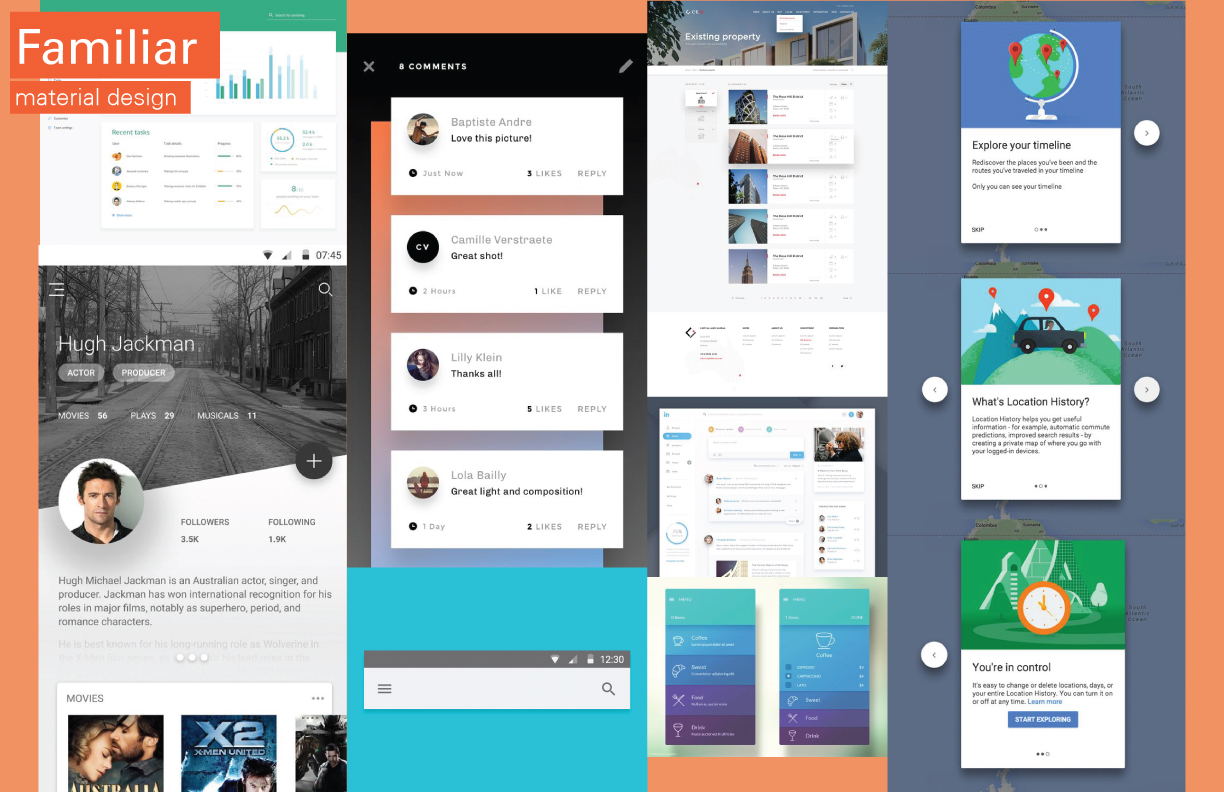
FUTURISTIC INTUITIVE CONFIDENT CLEAN FAMILIAR
From the five keywords, I put together mood boards to guide the treatment monitoring GUI.
Brainstorm & concept ideation
I presented my research finding and design criteria to the team. Following that, I invited everyone in the team to the brainstorming session. This practice allows me to see fresh ideas from founders and engineers perspective.
Following the brainstorming session, I came up 30+ concept ideation ranging from the big system to detail function.
Features & information hierarchy
LOW-FIDELITY PROTOTYPE
One of the main problems for today’s medical user interface is information overload. Even though the majority of doctors said they want to see all the information, that doesn’t mean all information should display altogether in one screen. During the low-fidelity prototyping, I am testing not only the concept we came up with but also information hierarchy through paper prototypes within the team. This exercise allows me to understand what information and features are more important than the others.
Layout & usability testing
MID-FIDELITY PROTOTYPE
From my low-fidelity prototype learning, I further refined and created the mid-fidelity interactive prototypes. The goal for the mid-fidelity prototypes is playing around the interface layout as well as testing the prototypes with med students and doctors to get further feedback.
Production
HIGH-FIDELITY PROTOTYPE
In the high-fidelity prototyping phase, I added color and details into the interface as well as working on the UI copy with the team members. Many field testing and editing have been done throughout this phase as well.
After giving the final prototype to the developers, my role became assisting the developer for any detail editing and missing parts.
Version 1
Version 2
Challenges
I wasn’t able to collect enough data and feedback during low and mid fidelity testing. The result was that I had to spend extra time changing high-level system design during the high fidelity phase.
Possible reasons
Lack of detail scenario
During testing, the only task I asked the participants to do is “how would you perform focal laser therapy with this software?” Instead, I should have given detailed scenario and tasks.
Lack of context
I conducted all testing with physicians either in the doctor’s office or at a coffee shop using my laptop. This caused the tests to lack a sense of pressure that is present during surgeries done in a clinical setting with a real patient.
Style guide
Open house
For investors, friends, and family
